
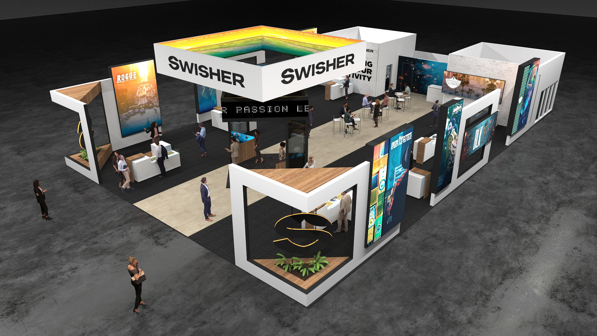
Swisher Street - NACS 2023
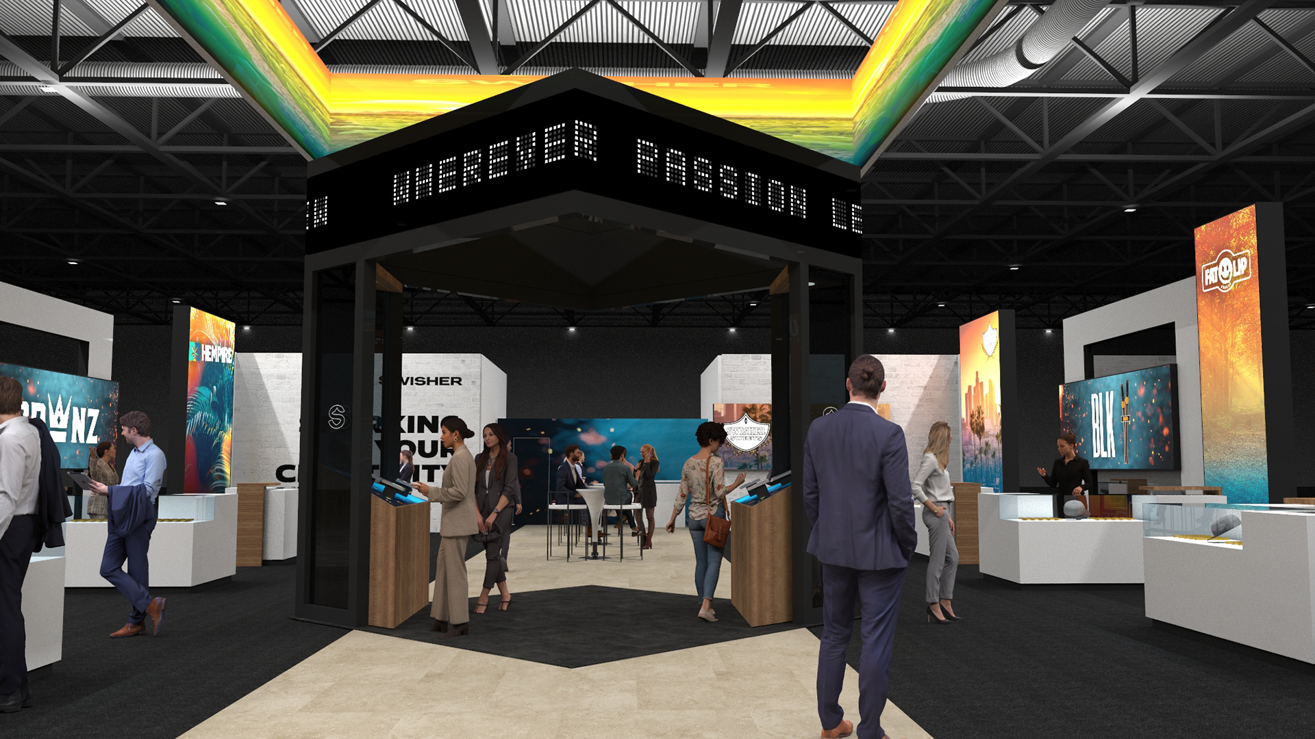
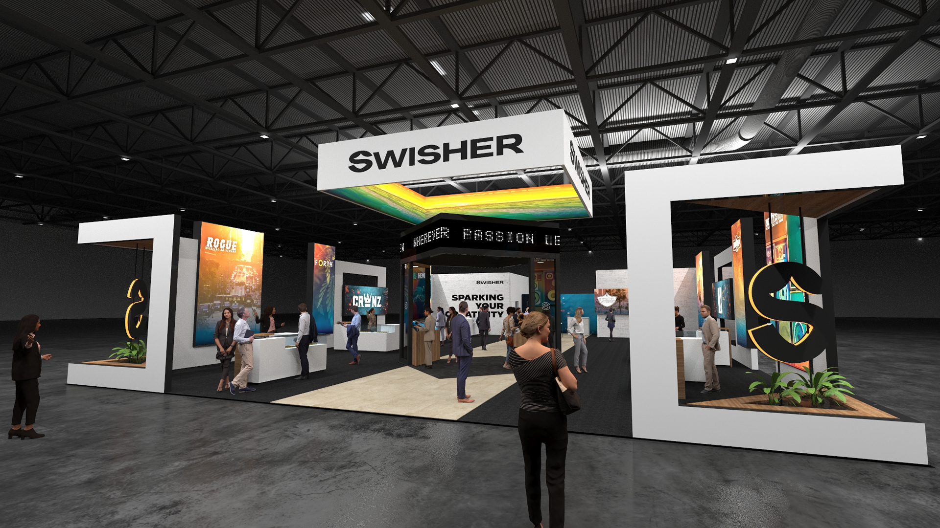
"Swisher Street" for NACS 2023 in Atlanta, GA was designed as a dynamic, urban-inspired booth space that captured the essence of a vibrant and trendy city street.Each section of the "street" was dedicated to one of Swisher's brands, featuring distinct visual elements based on the given brands product profile. Swisher asked that we center this design to function modularly as a build, to accommodate for both fabric graphics as well as LEDs, an emphasis on LED panels for more video content and to unify the family of brands while also highlighting their new release.
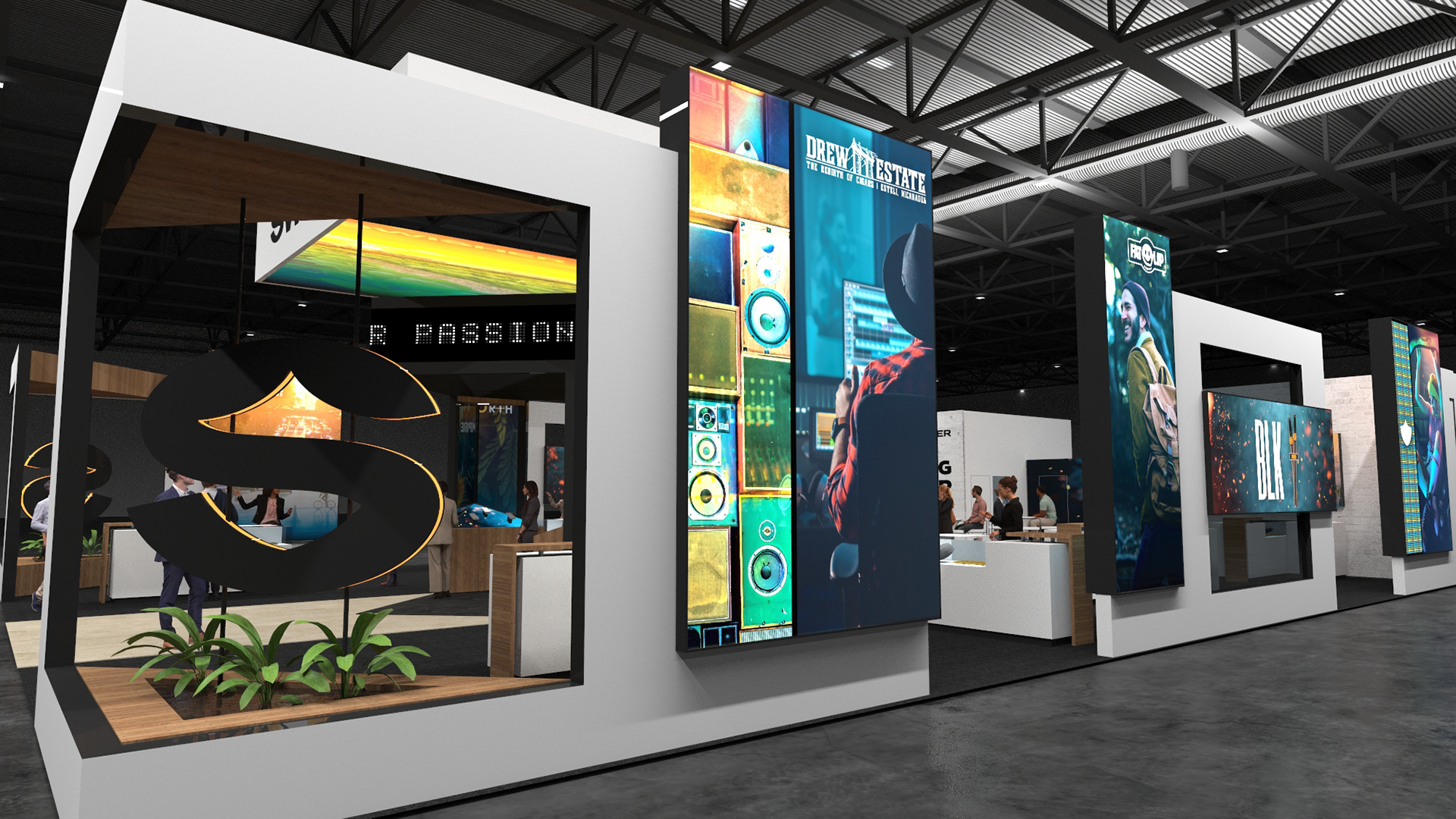
With these client requests in mind; the booth was designed to be modular for scalability at other Swisher participated events with exterior backlit fabric graphics to emulate a store-front display look and feel, with LED panels on the interior of the booth that mirror the same graphic space as the exterior fabric graphics. The exterior split panel graphics (Swisher Sweets and Empire Estate) were designed to house both backlit fabric graphics while coupled with an LED panel. The center island was designed in a "news stand" theme to highlight Swisher's most recently released product, CRWNZ. The graphic treatment and booth space we're sold as is with few modifications, a key component of this win with the client being the unified brand look and feel that brought Swisher's 9 sub-brands into one cohesive family for the first time.
My favorite addition to the booth, though small, were the tobacco plants placed under the Rogue and Swisher Sweets fabricated logos. This was a small nod to the source of the products, the agricultural background, and a peak at the product in a way that most consumers haven't experience before.
Project Ownership & Collaboration
Agency: MC2 / Swisher
My Role: Creative Director + execution for over-arching strategy and design direction in collaboration with 3D on structural placements and material choices for initial RFP. MC2 was awarded the account based on first round creative and wanted very minimal changes to the direction of the space. I was the sole 2D design, art director from RFP to final show production.
Internal collaboration between 3D and 2D design processes.


Creative Ideation
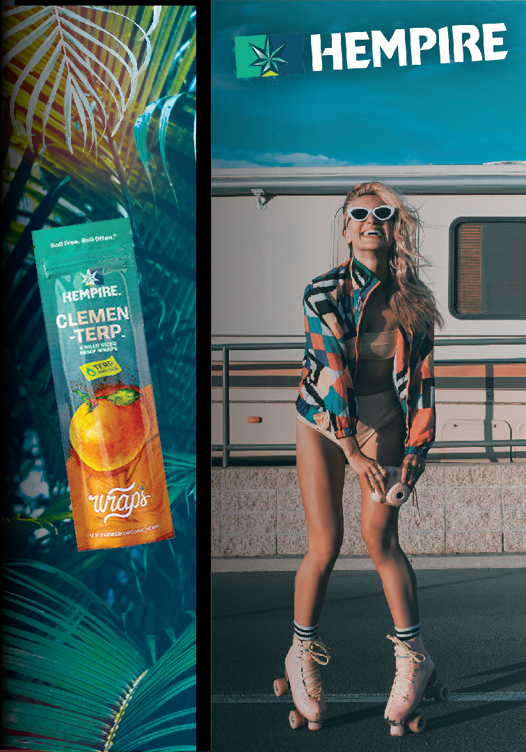
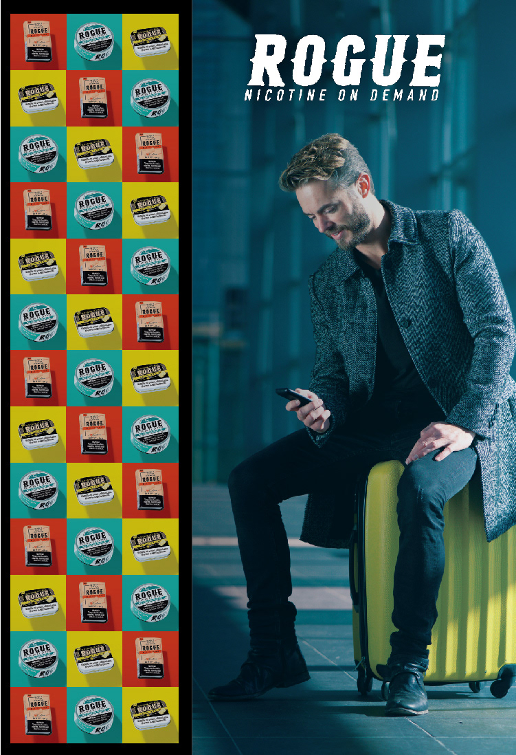
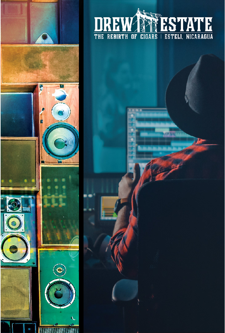
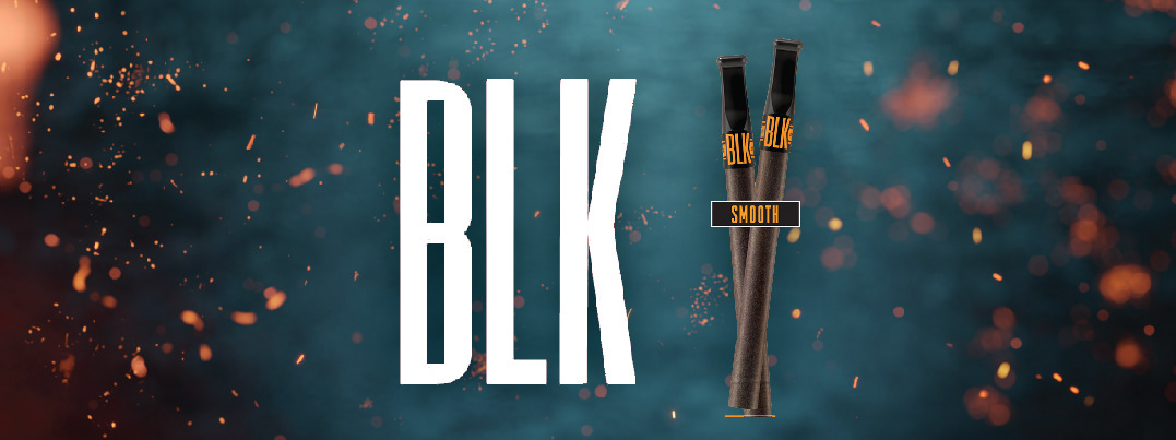
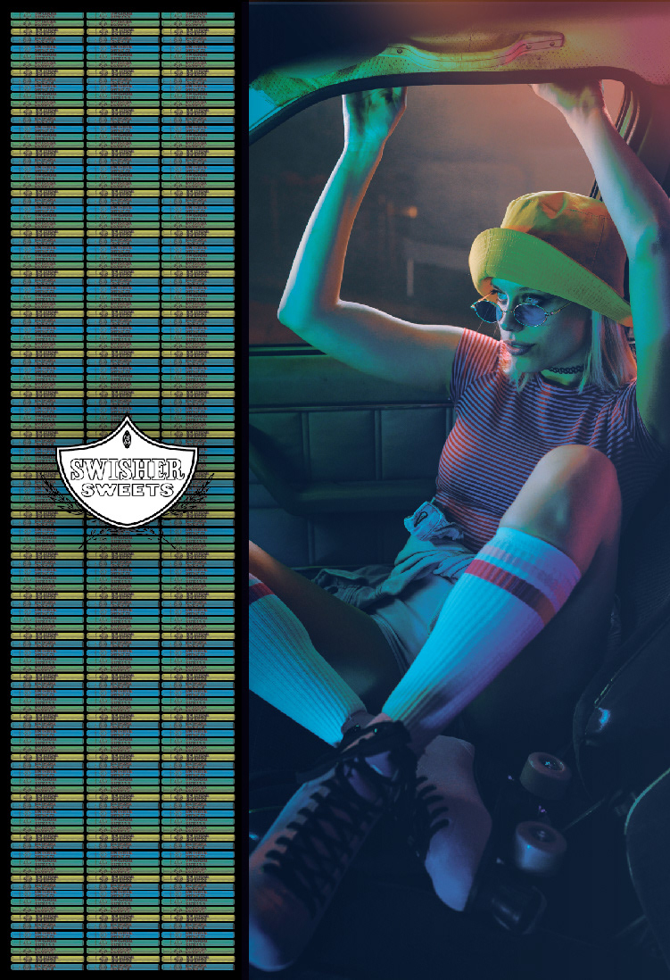
My inspiration for the graphic look and feel came from Swisher's tagline, "Sparking your creativity", coupled with my own personal brand experience centered in one of their most dominant market locations; the west coast. When "rolling one up" on the west coast, Swisher Sweets has always dominated the market and has a reputation. So after living in Southern California for 10+ years, I applied the thought process of "where would you be and what would you be doing while consuming this product". Think roller skating in Venice beach, at the studio making music, out on a hike at Runyon Canyon - these are all actionable things and places that have their own demographics of consumers. My intent with the graphics was to visually communicate to the individual consumer groups per sub-brand, while brining this diverse group of products under one cohesive look and feel represent the larger parent brand Swisher.

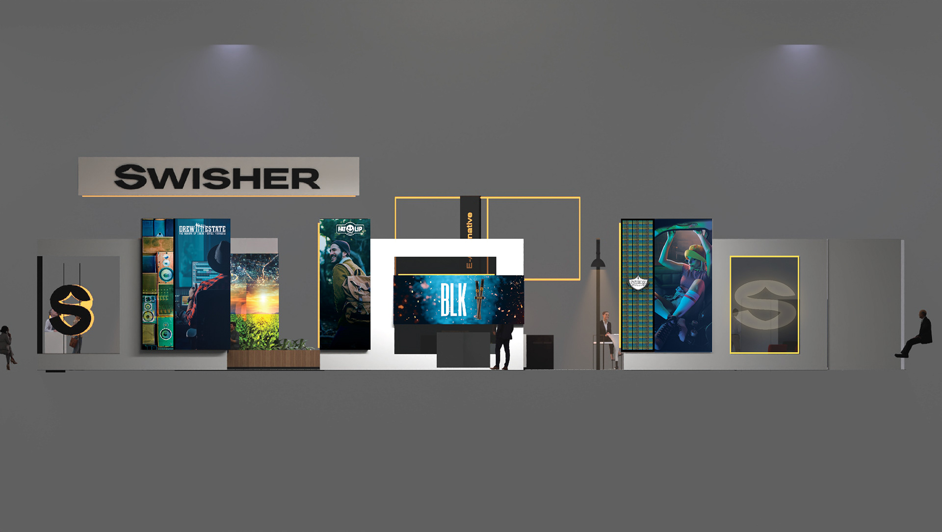
Above: Outside of House - Exterior Right
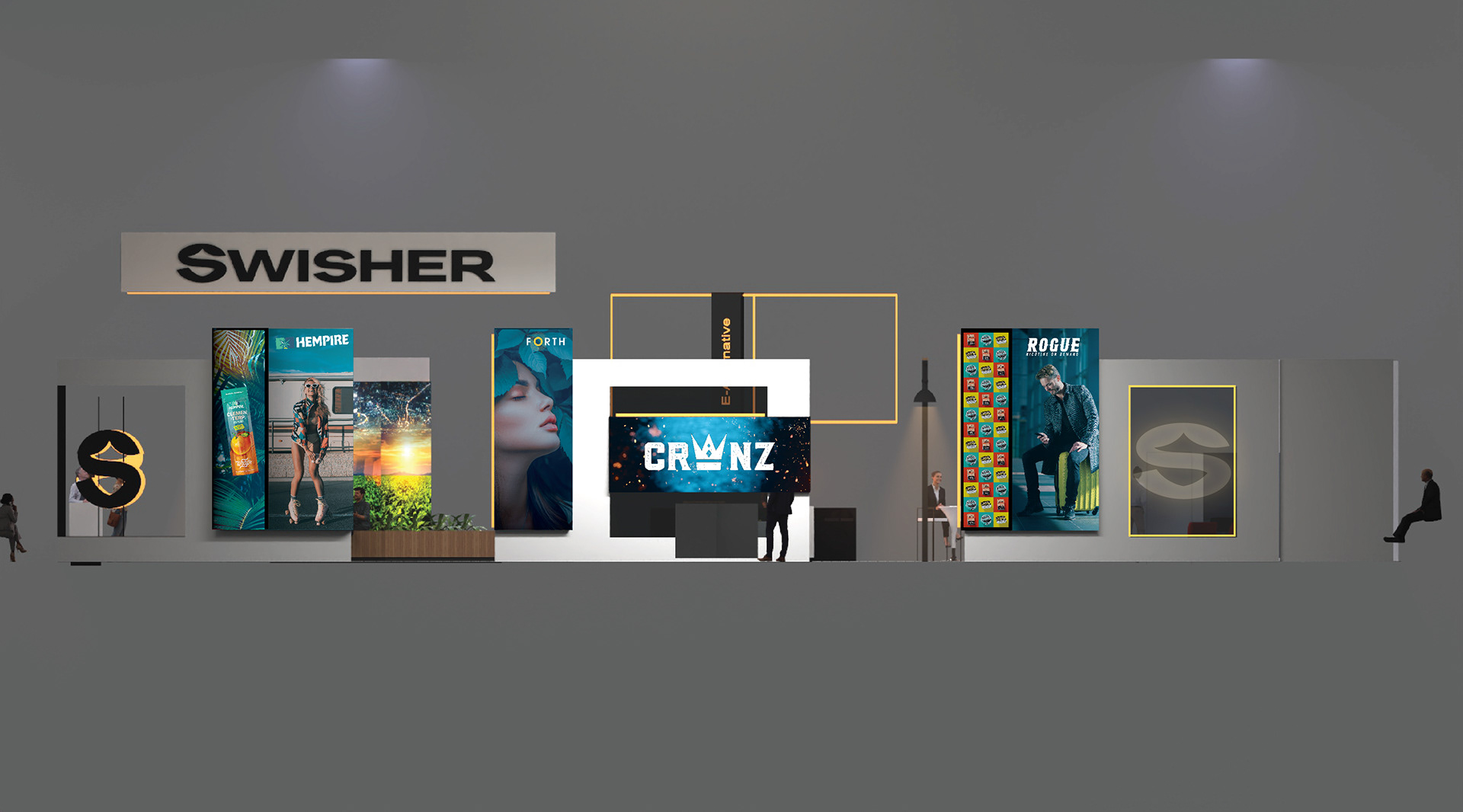
Above: Outside of House - Exterior Left